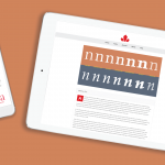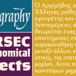
8 New Gibson Fonts
Looking back from the inside at how the Gibson fonts grew into the phenomenon they’ve become is kind of strange now. When Rod McDonald gave us the four core Gibson fonts and told us to make italics then do the production work, it was a straightforward thing — inasmuch as normal type design assignments are considered. Rod’s idea in late 2010 was pretty straightforward as well: Release a decent corporate sans set, price it so it’s affordable to design students who would otherwise have to either resort to piracy or spend quite a bit to on a corporate font family, then give all the money it makes to causes that nurture and grow design and typography awareness in Canada. What happened after we released the Gibson fonts was very much beyond everyone’s expectation. Demand for it went through the roof almost instantly, which caught pretty much everyone involved off-guard. Quite pleasantly so, but still off-guard.
This was a big deal for everyone involved simply because of the stoic surrender type designers have come to exhibit as a matter of course in their chosen profession. We do our creative labour in a mental environment that can best be described as a spiky EKG rhythm strip of emotions. We pour all our hope and enthusiasm into an alphabet while at the same time fearing and accounting for the shrug it may get from the design cosmos. The cosmos is a big and very noisy place, so the experienced among us have learned to recognize the odds and take things in stride. It’s infrequent that the stars align and a type design makes it big in a royal flush kind of way, but that’s what happened with Gibson. And for a while there, nobody on the inside expected that royal flush or knew how to react to it.
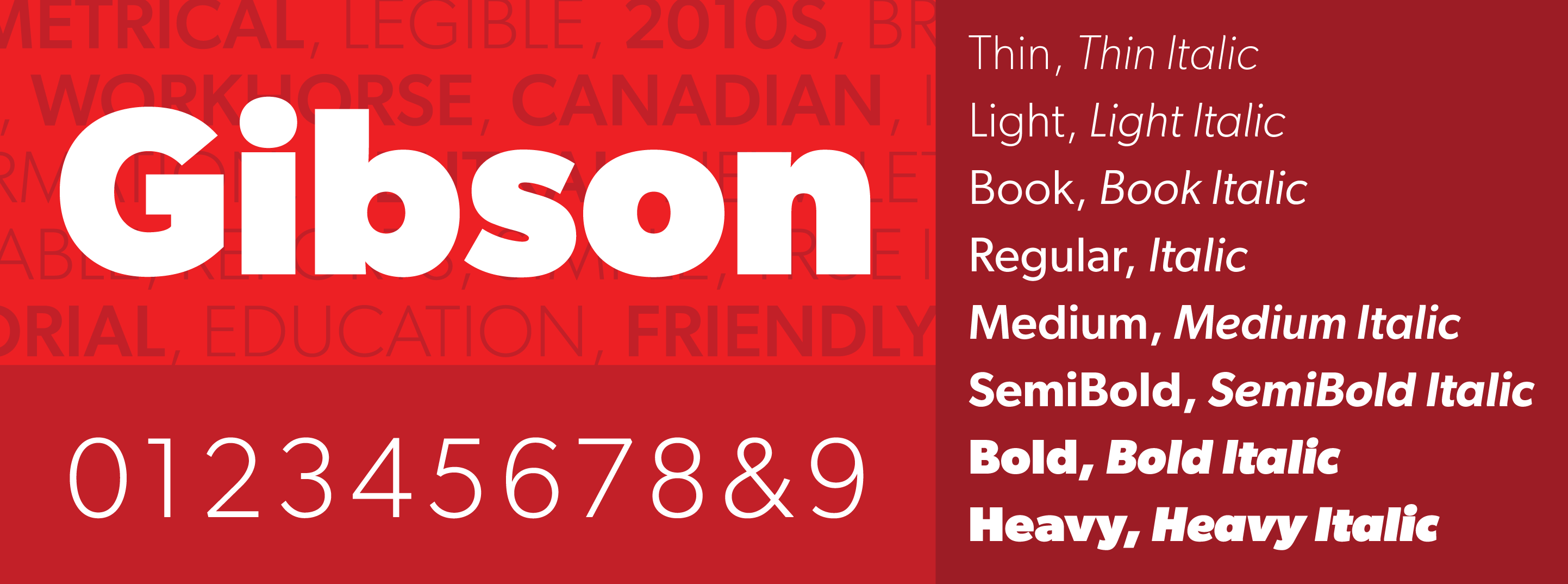
It’s been over eight years now, during which time Gibson has done quite a bit of good for the causes it intended to serve. So, stoic surrender or not, expanding this family has been on our minds for a while, not because of some great calculation in marketing or type industry thinking, but because we see it all over the place, and we think that offering more options to Gibson’s users would help both them and the causes that the font ends up serving. So here we are now, with four new weights and their italics.
The new weights are in fact ones that have been requested many times over the years. Aside from Gibson Thin, which probably was the weight most asked for, the requests would come in the form of something like “Can we have a weight between this weight and that?” So Gibson Book is the weight you want between Light and Regular, and Gibson Medium is the weight you want between Regular and SemiBold. A Gibson Heavy is also there now, for those gigantic statement environments where it’s OK to run letters into each other and shock eyeballs into submission, like they did in the 70s and 80s.
So here you go. More Gibson! We hope you find the new weights as useful as you did the initial 8-font set.
>