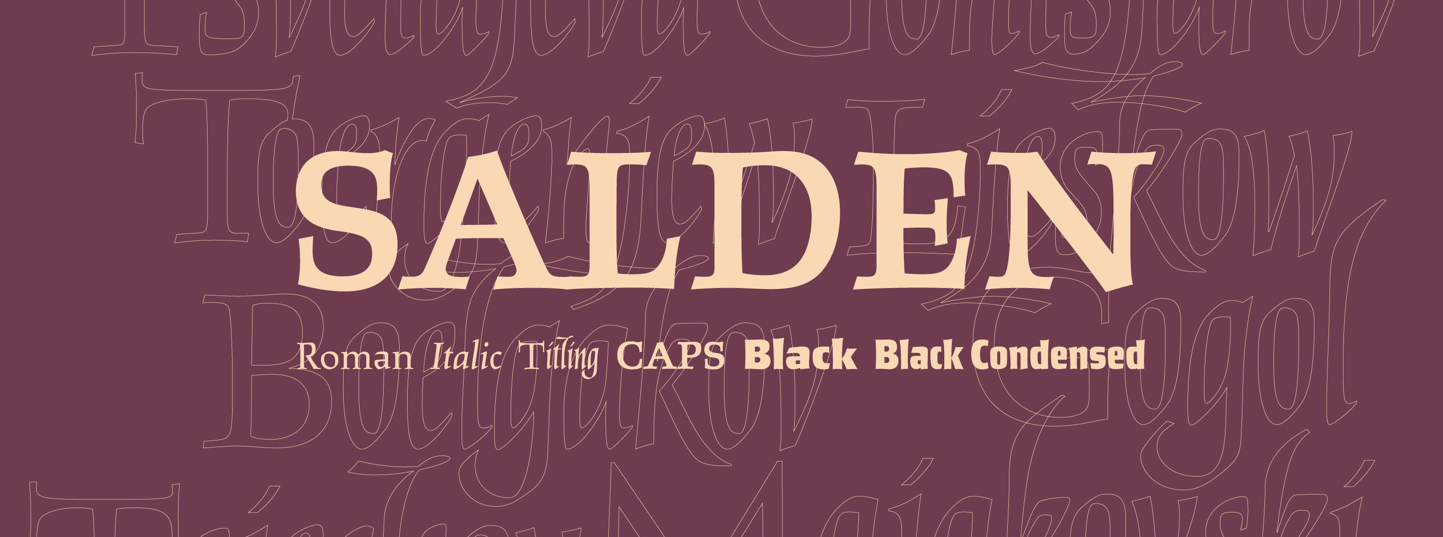
The New Salden Fonts
It is quite fitting that the Salden family is announced as the first new release on the new Canada Type website. Both the font family and the site took quite a few years to reach this point. The fonts took much longer, though. Hans van Maanen sent us his first attempt at what became Salden Caps some time around the fall of 2009. Many interesting things happened since then. But rather than wink at you with there-was-that-time-when stories, let’s introduce you to Helmut Salden (1910–1996), then talk a bit about the new fonts.
Helmut Salden
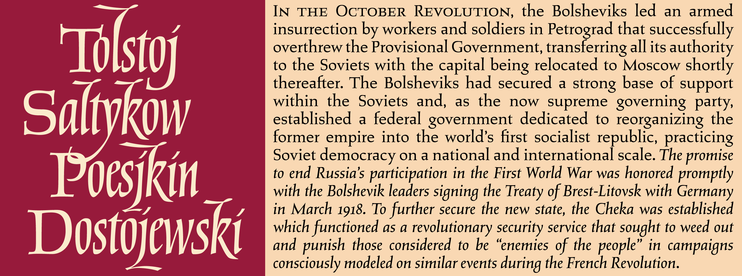
Helmut Salden’s lettering was unavoidable in the Netherlands for more than four decades, starting from the late 1930s. During that period, he was the most sought-after book cover designer, and his logo/monogram work was all over the country. He was born in Essen, Germany. He studied lettering and graphic arts at Folkwang University, and was part of the Bauhaus movement for a while before deciding to take a more classical approach to design. In 1934, he left the politically charged atmosphere of Germany, and spent three years in Paris and Spain before going to Holland, where he studied for a year at the KABK. He spent part of the war in concentration camps, then he settled in the Netherlands. He elected to design book covers for a living, and became very good at it. His work is mostly associated with Amsterdam publisher G.A. van Oorschot, but he also designed quite a few covers for other Dutch publishers, like H.P. Leopold, Hollandia Drukkerij, A.A.M. Stols, Bruna, and Elsevier. Even today, if you visit a bookstore in the Netherlands, you will likely see some of Salden’s book covers — like the recent edition of the Complete Russian Works Library issued by G.A. van Oorschot.
For more info on Helmut Salden, with amazing visuals, check out a Dutch book called Helmut Salden Letterontwerper en Boekverzorger, published in 2003 by Uitgeverij 010, Rotterdam, in concert with Katja Vranken, Salden’s widow. The book includes essays by Gerrit Noordzij and Salden himself. To see much of Salden’s work up close and personal, a visit to the historic and wonderful Museum Meermanno (House of the Book) in The Hague is highly recommended.
The Salden Set
Attempting to make a font family that pays tribute to Helmut Salden’s work is a tall order by any standard. The main reason he was considered the “face of the Dutch book” for so long is his inimitable lettering, which was very wild, free and left a heck of an impression. He hardly ever used any typefaces, partly because he didn’t like the limits that mechanical typography imposed on his work, but also because what little background he had with the minimalists gave him a sense of counterspace that was ahead of the faces produced and published by type houses at the time. He drew letters, sometimes entire alphabets, which he reused, adapting or modifying them on an individual project basis. His method of working meant that whoever tried to build a typeface from his work would have to go through countless projects, see what fits, and use a process similar to Salden’s: Adapt and modify on an individual project basis. We were more than willing to do that, of course, but we were also mindful of the implication that any kind of authentic revival was not in the cards — and there really wasn’t anything to revive, since these weren’t typefaces we were talking about in the first place.
So we thought the best way to approach this was to break it down into genre pieces. The famous Salden caps, his wildly dark and chunky flared sans lettering, his recognizable olstyle letters (which he occasionally complemented with his own italic forms), and last but not least, the mind-blowing hybrid of swashy script and upright italic forms which he used in combination with upright Roman caps he drew specifically for that kind of title design. So six projects in all.
It was a long road making each of them, especially since we decided early on that we wanted to include Cyrillic and Greek in all the fonts, small caps in the Roman font and its italic counterpart, and all the alternate and swash variants we can find and/or adapt for the Titling font. The lengthy process, a usual type designer point of bellyaching, really wasn’t too bad, because the work was quite enjoyable. This project was quite the educational experience, and studying Salden’s work in detail was very rewarding on many levels.
Interestingly enough, this kind of font family release turned out to be exactly the kind of thing we’ve been resisting for a couple of years now. The trend of mixing genres in a mini-set always seemed kind of flawed and rooted into that whole font pairing thing that seems to occupy some layout artists these days. But in a situation where one has to pay tribute to someone whose work is of such breadth and versatility, it seems like the ideal thing to do. It works because if a designer wants to roll like Salden, they’ll want to do it all the way — so that’s what we ended up aiming to offer.
More info about the fonts can be found on the Salden page in the font library area. We hope you have as much fun with these fonts as we had making them.
>
english writing lessons
custom college essay writing service