Note to future generations: It’s April of 2020 and humanity is dealing with a thoroughly unfamiliar situation that so many of us are calling unprecedented and unique in history — though it’s probably neither. Along with this, we have a kind of linguistic shuffle that mainstreamed new buzz phrases like self-isolation, social distancing, work from home, flatten the curve, bailout, price gouging, pandemic economy, new normal, and many other brow-raisers. Prior to all of this, we’d kind of crammed ourselves on every level — small urban spaces, tiny personal media, an unhealthy focus on the ephemeral, gluttonous consumption and unfairness to each other, etc. And now that the vibe of a possible fresh start is becoming more prominent by the week, we wonder if the other side of this thing will bring forth a new era of communication design. Will post-virus design mandate that super-distances and sprawling spaces become the new visuals of peace and comfort?
More Corey
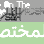
These are certainly strange times, but we’re trying to make the best of our circumstance. It seems like a fitting time to get nostalgic and revisit familiar territory, re-read older books, listen to older music, appreciate older art, stay grounded with common tasks, and find joy in usual work. For us, that means fonts. A few weeks ago we introduced Compunabula, our first Corey Holms release. And now we keep rolling with Corey. We just put the final touches on a couple of his other designs, and are quite excited about them.
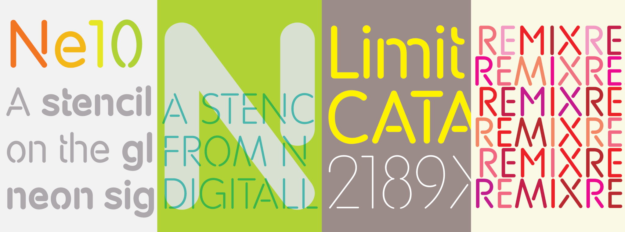
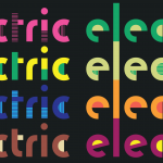
Ne10
What does a designer do after seeing the same thing over and over again for quite a while? Try to adapt it into something else, of course. The Ne10 family is the digital offspring of a deliciously weird neon tube sign Corey spotted at a pizzeria in his Los Angeles neighbourhood when he lived there. The sign, advertising a beer brand, showed a few uppercase letters that bore little aesthetic relation to each other aside from their inner glow and tubular nature. Ne10 winks at that sign a bit, though is not quite blatant about its reference.
Ne10 is a monoline stencil sans family. It kicks the tubular versatility factor up a decent notch with five weights, ranging from pretty Thin to quite Bold, and plenty of included alternates. This face was made with particular attention to common usage in sizes large and small, which makes it a solid tool for bridging the gap between corporate and urban communication.
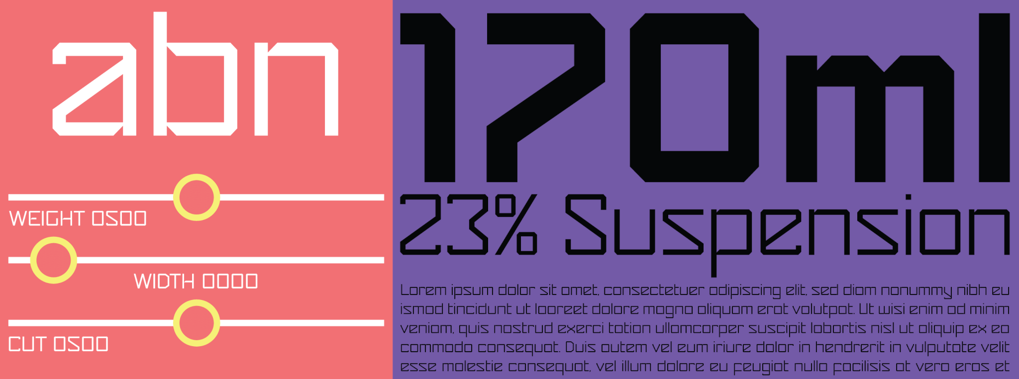
Mode
Gridniks and futurists rejoice! We have a typeface that anticipates that post-pandemic design future we were wondering about out loud earlier. It’s got the geometry. It’s got the modularity. It’s got the angles. It’s got the sharpness. And it’s got that physical distancing order kind of built right into it
Mode was originally intended as a single font put together from two letters Corey Holms had drawn for a logo design, then this alphabet took on a life of its own in the production stages. Character sets were expanded, many alternates were added, weights were built up (and down), and widths were established. And of course, just because we love it, we put it all together in a three-axis variable font for typographers who like being on the cutting edge. So you can make it thin and wide to make sure they keep their distance, or scroll-bar it thick and tight to affirm that solidarity. There’s even an axis to control the way crossbars and similar horizontals attach to stems.
Mode comes in five weights and two widths, two sets of stylistic alternates (including biform/unicase variants), and an expanded Latin character set. It’s available in single fonts or choice packages. The variable font is included as a complementary bonus with the purchase of the complete family.